Make beautiful AI Charts
Newsletter AI Charts transforms plain numbers into modern visuals that tell your story.
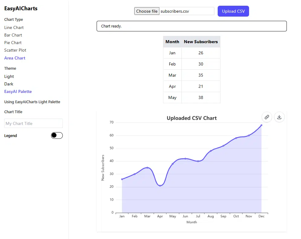
No Excel. No coding. Just paste your data or upload a small CSV, and AI picks the best chart style: line, bar, area, or even word cloud. Each of them is designed to fit perfectly into your newsletter layout.
Newsletter AI Charts Lab is ideal for:
- Substack and Beehiiv authors who want quick, beautiful visuals
- Marketers, consultants, and coaches presenting performance updates
- Small businesses sharing monthly stats or campaign insights
- Data-curious creators who want storytelling charts without learning analytics tools
How it works?
- Paste or upload your dataset (or type a short summary like “monthly subscribers 120–420”).
- The AI suggests the most fitting chart and color theme.
- Download your chart as an image ready for your next newsletter post.
WordCloud Feature
You insert the text:
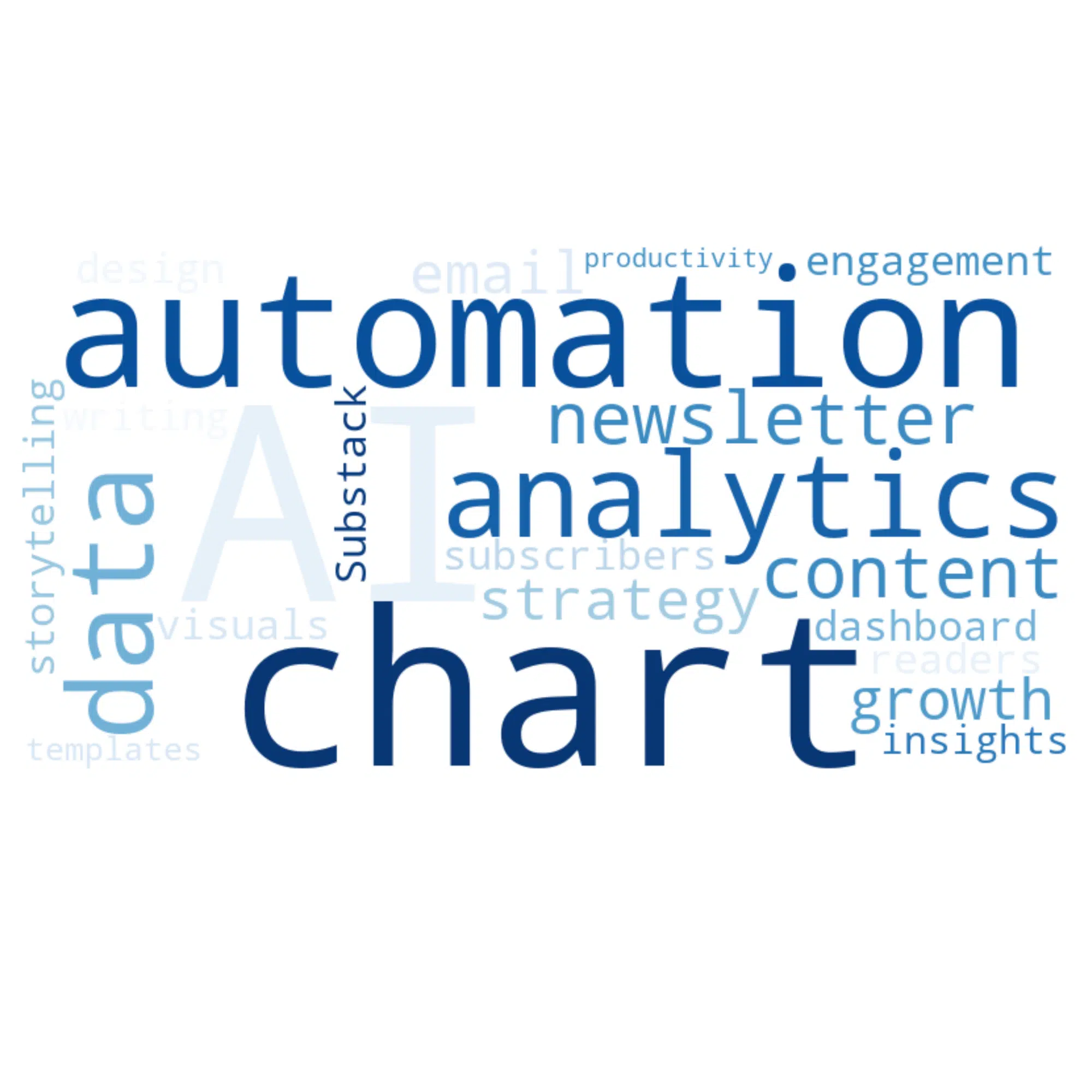
AI automation AI analytics charts data newsletter content strategy email growth subscribers engagement visuals storytelling dashboard AI
Substack design readers insights writing chart templates productivity
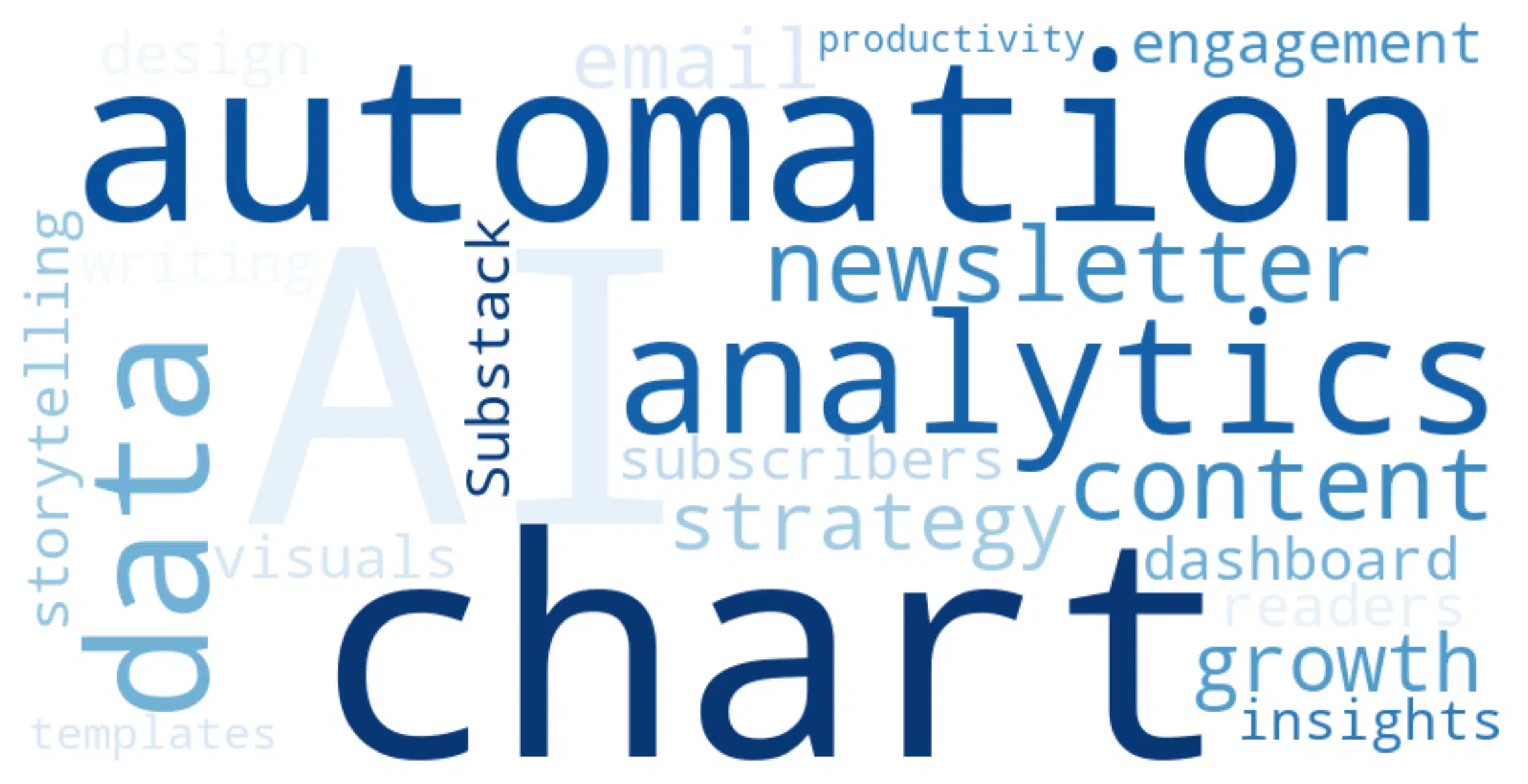
The AI Charts Lab Generates this Word Cloud:
Why authors love it?
- AI Chart Generation: Describe your data, AI chooses the right chart for you.
- Substack-ready images: Automatically exported as clean PNGs that fit perfectly in emails.
- Modern design: Soft gradients, readable fonts, and storytelling visuals made for writers, not analysts.
- Interactive preview: See your chart move and explore trends before saving.
- Word Clouds & Highlights: Visualize your most-used words, topics, or audience insights.




Reviews
There are no reviews yet.