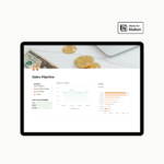
Many of our clients liked our Sales Pipeline Notion Template, and we put all the charts in a Sales Dashboard Power BI.
Table of Contents
Power BI is one of the most popular Data Visualization tools. It helps you create amazing dashboards without coding skills.
Power BI is part of Microsoft tools and is a great choice for Excel users. Everybody who uses Excel for their business data can transform and clean data using Power BI. Also, the dashboards and visualizations are so practical and easy to build that you can easily impress the boss with this tool.
The first impression
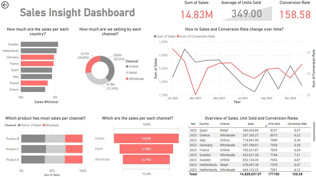
This is a sneak peek at the Sales Dashboard Power BI. It is based on a sample of data that consists of fields: Product, Channel, Country, Date, Sales, Units Sold, and Conversion Rate.
The Sales Dashboard Power BI comes with:
- the Power BI file in .pbit format,
- the sample data file in .csv format,
- the theme in .json format
- the guide in PDF.
We built the dashboard upon main questions about the sales.
The idea before starting to build the dashboard
When building Sales Dashboard Power BI we choose clarity and simplicity as principles. Also, we could not negotiate in these components:
It’s built for the right audience
Not all dashboards are the same. A dashboard for a marketing team won’t look like one for the CEO.
- Operational dashboards show day-to-day numbers for teams.
- Strategic dashboards show high-level goals for leadership.
The best dashboards always start with one question: “Who is this for?”
Let’s make it simple and clean
Dashboards don’t need to show everything. Too much information is overwhelming.
Focus on what matters most. Cut out the rest.
Less clutter = more clarity.
It follows a grid
Using a grid helps both the creator and the viewer. It makes things neat and easy to follow.
People read left to right, top to bottom. Sales Dashboard Power BI is designed for that natural flow.
It looks good, but not complex
A dashboard should first be helpful. But if it’s messy or ugly, people will not use it.
We chose and used only one font. The dashboard also combines three colours: two grey tones and red to highlight growth or warn about a drop.
It loads fast
No one wants to wait. If your dashboard takes too long to open, people won’t use it.
Speed things up by:
- Keeping visuals simple
- Cleaning your data beforehand
- Avoiding heavy calculations inside Power BI
Conclusion
Every business needs to monitor its sales. Our data Experts most frequently deliver this service on freelancing platforms. Our template Sales Dashboard Power BI is easy to use and plug-and-play.
The result: an impressive dashboard, data-driven insights, decisions based on data.

